Create a Polaroid Inspired Photo for the Project Life App
Posted on under Project Life, Scrapbooking With Apps
Welcome back to another app tutorial. Thanks for joining us again here on the blog! If you’ve followed any of my Sahlin Studio blog posts, you know I am an avid app scrapper. The Project Life App is the base for most of my pages and, after having used that app for a while, I now love learning how to combine other apps with that one.
Today, I want to show you how to create the nostalgia and fun of a Polaroid image to your Project Life pages using your phone and the Collect App. You can also use overlays from the Project Life App or any Sahlin Studio digital kits, but let’s begin with the Collect App!
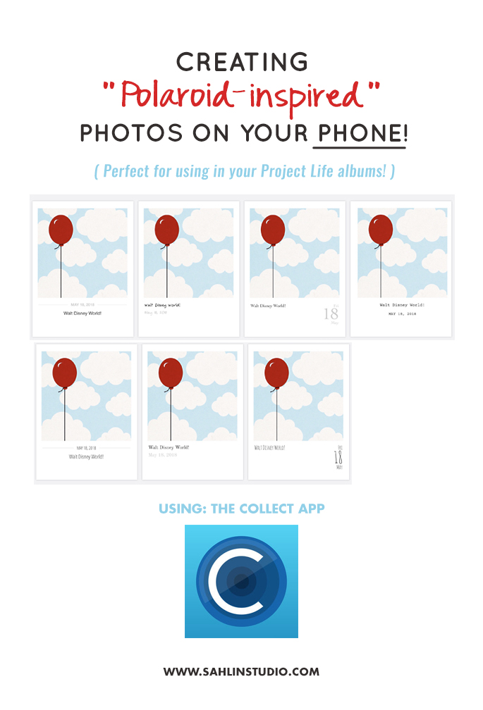
The Collect App is the simplest way to achieve the Polaroid inspired look! Simply add your photo and a line of text then the Collect App will align everything for you to create the image. I’ve been inspired by many fellow app scrappers who are using this app! They’ve created some stellar pages and because I’m always looking for a new way to document Disney vacations, I think Collect and Project Mouse are a fun and magical combo! I love the retro look and the little bit of white space helps bring focus to the picture you are trying to highlight.
Video Tutorial
Here’s an overview video on how to add your photos or Project Mouse cards to Collect. For step by step photos, see below!
Step by Step Instructions
Here are some screenshots to help you create one of these images step by step.
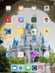 Collect App Icon, tap to open Collect App Icon, tap to open |
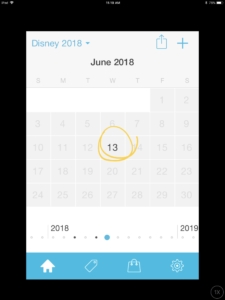 Tap on a date Tap on a date |
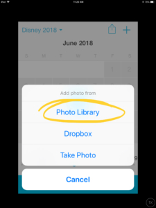 Choose your photo’s location Choose your photo’s location |
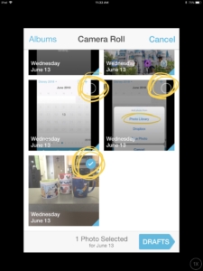 Choose one photo or press and hold to select multiple photos Choose one photo or press and hold to select multiple photos |
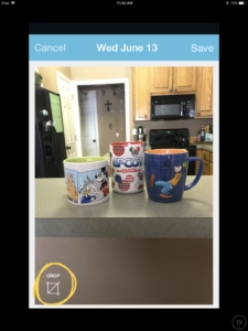 Crop, if desired Crop, if desired |
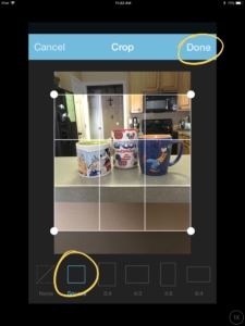 I always choose the square option then tap done I always choose the square option then tap done |
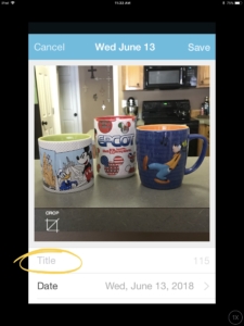 Tap to add a title, if desired Tap to add a title, if desired |
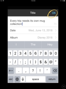 Add title and then tap OK Add title and then tap OK |
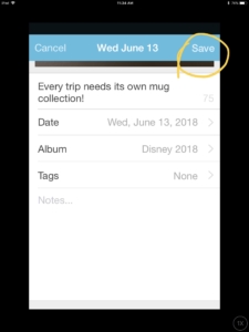 Edit any other info, if desired, and tap Save Edit any other info, if desired, and tap Save |
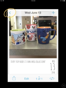 Tap the back arrow Tap the back arrow |
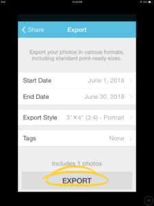
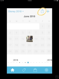 After all your images have been added, export from the Calendar page After all your images have been added, export from the Calendar page |
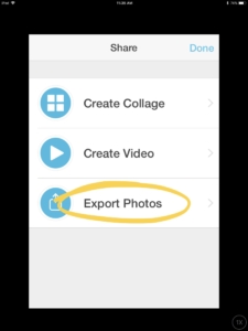 Tap here to Export Photos Tap here to Export Photos |
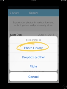 Choose where you want your Collect cards exported to Choose where you want your Collect cards exported to |
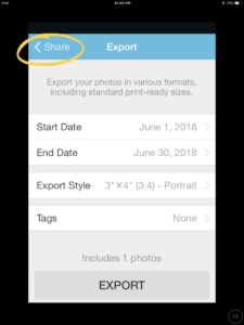 Tap on the screen after you see the “exported successfully” window pop up and then tap the back arrow Tap on the screen after you see the “exported successfully” window pop up and then tap the back arrow |
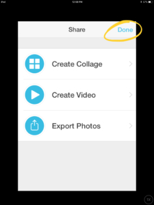 Tap Done Tap Done |
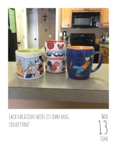 Viola, this is the exported image! Viola, this is the exported image! |
Check Out the Photo Text Options in the Collect App
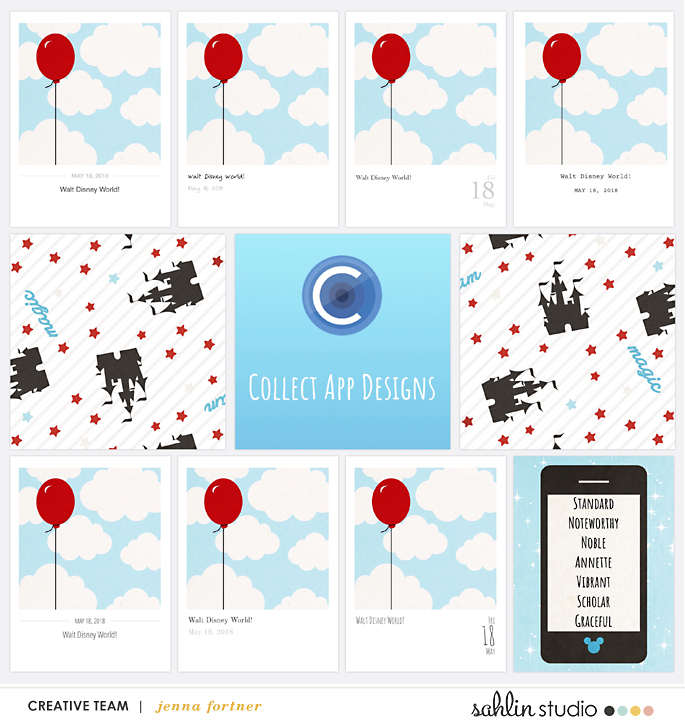
Here are the seven different designs you can create with Collect. The differences are subtle, but I love the classic look of Annette and the whimsy of Graceful.
Let’s See Them in Use
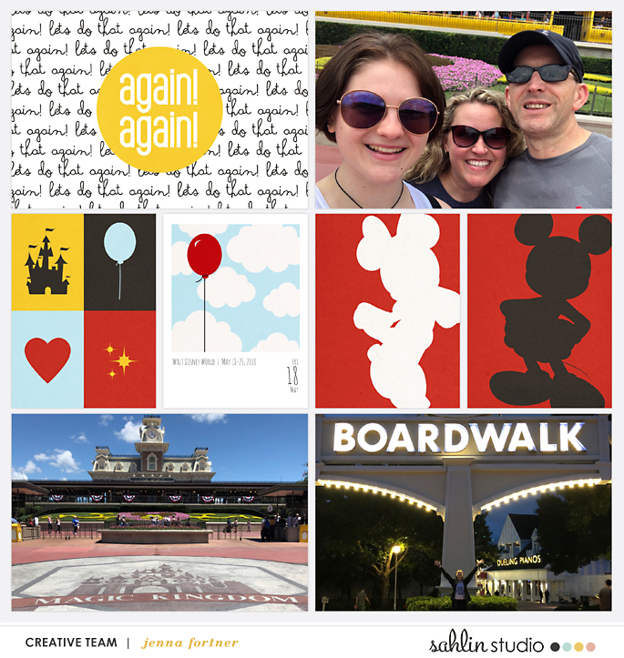
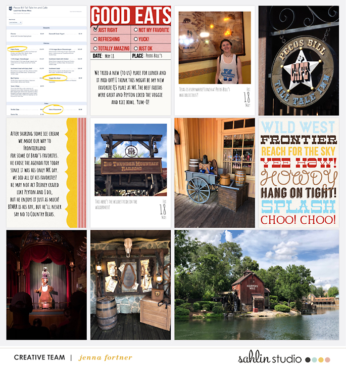
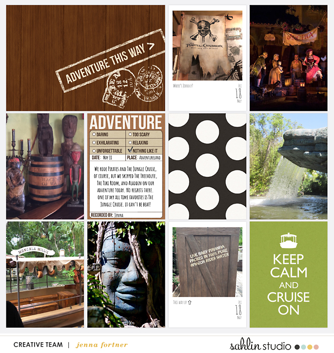
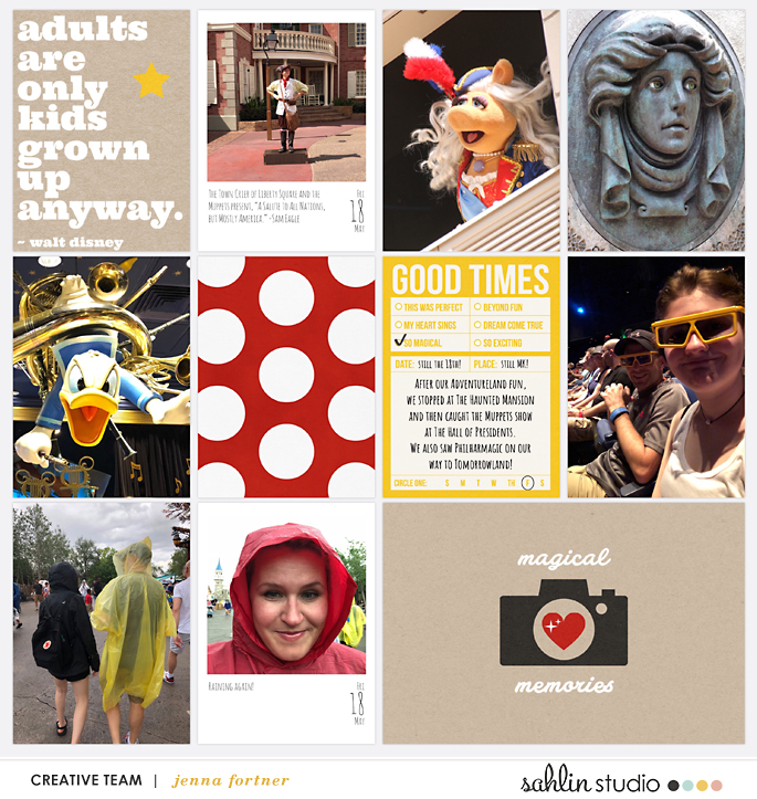
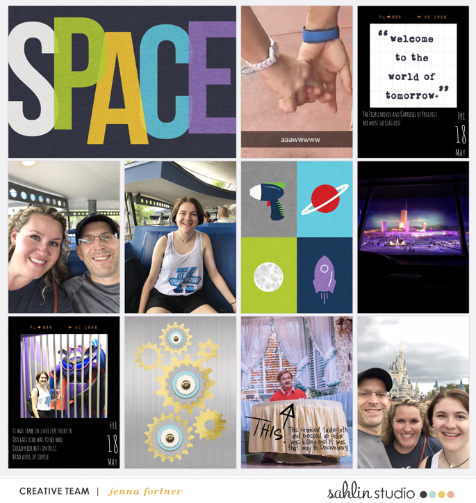
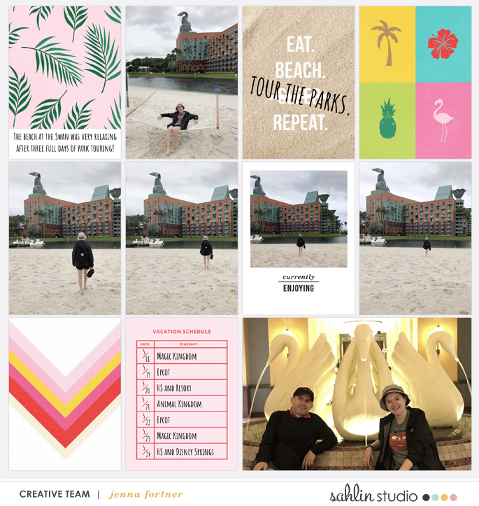
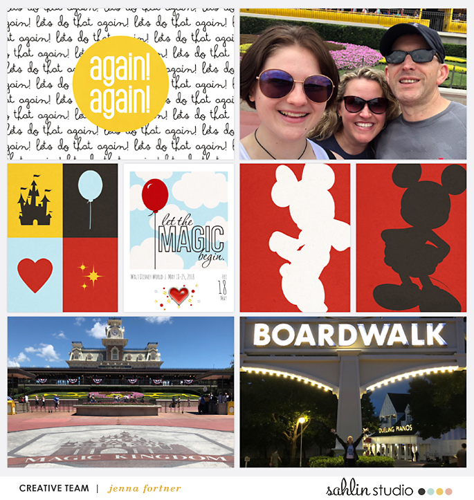
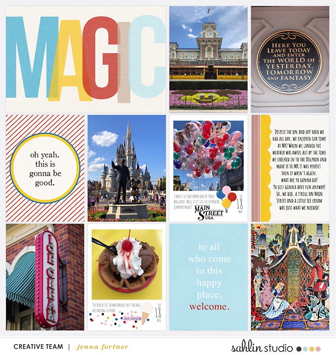
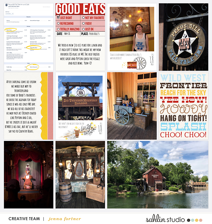
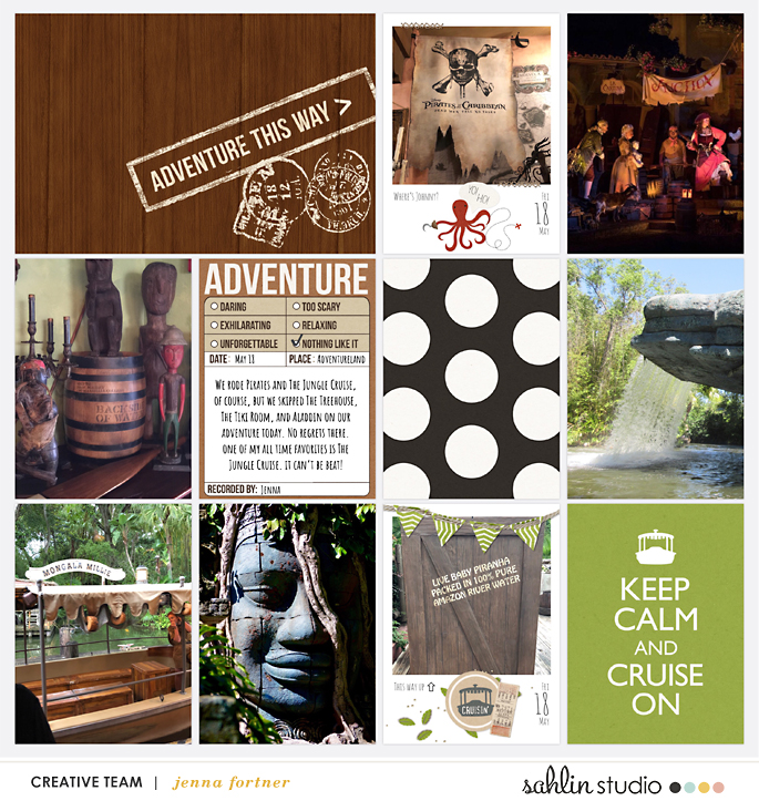
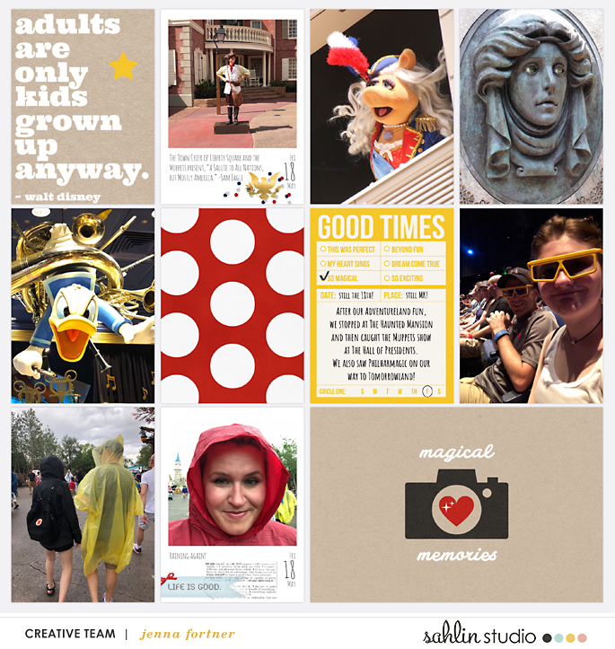
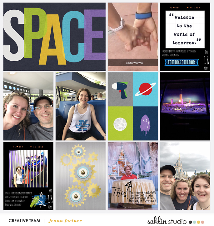
After exporting the cards from the Collect App, simply add them to your Project Life page as you would add a photo. I liked adding a little something extra to these pocket pages and trying something new (to me) for our most recent vacation scrapbook. We are lucky enough to visit often so I enjoyed documenting this trip with a bit of a twist on my usual pocket pages. Shown here is my 2018 cover page and the first two spreads of my album.
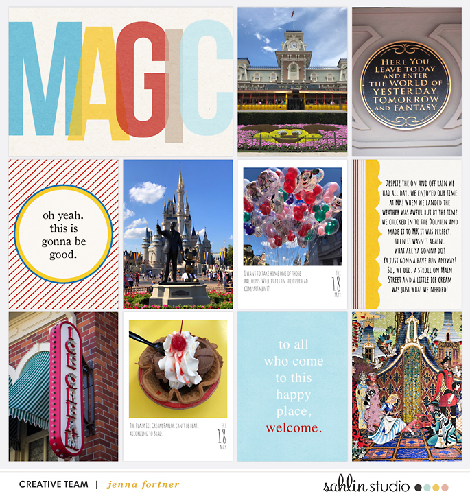
Main Street USA is my absolute favorite part of our day at MK. I loved documenting some highlights with the Collect App!
Tips For Using the Collect App
-Add multiple photos to one day in Collect by pressing and holding on one image in your camera roll and selecting multiple images.
-Export only one card from a day that has multiple photos by adding a tag to that day’s card.
-Create multiple albums for different projects.
-Remember to edit your photos before adding them to Collect.
-Double check your spelling and grammar before exporting from Collect.
-Be sure to look through all the Export Style Preferences. (There are options for leaving the date and/or the title line off of the card if you prefer to journal in your own handwriting after printing.)
-To use a Collect Card in the Project Life App, make sure Add Print Bleed is toggled on in your Export Style Preferences.
-To make the Collect Cards stand out on your Project Life App layouts, be sure your drop shadow is on and then chose a background color other than white. On the pages in this post, I chose a light greige from the P52 2016 Edition.
-The Amatic font in the Project Life App is what is used here for my journaling. The Collect Card design used on my pages here is the Graceful Design and it also features the Amatic font.
Other Polaroid-Inspired Options
There are multiple ways to add Polaroid inspired images to your pages. The Supermatic App is also a very good choice. However, if adding another app to your scrapping routine doesn’t work for you, The Project Life App’s Forever Young Overlays offer black and cream options. There isn’t a classic white one in this kit, but there is one in the Time of Your Life Overlays (you can mask the predesigned cutout using enlarged white letters and Freeform Text Boxes.) The frustration in using the Project Life App Overlays comes in making sure the size of the text you add to your overlay and the alignment of it are similar on each card. Collect does that for you and that is why I recommend it! Pictured here is the black overlay from Forever Young. I love the black option for a Tomorrowland page and also like the retro detail at the top of this one.
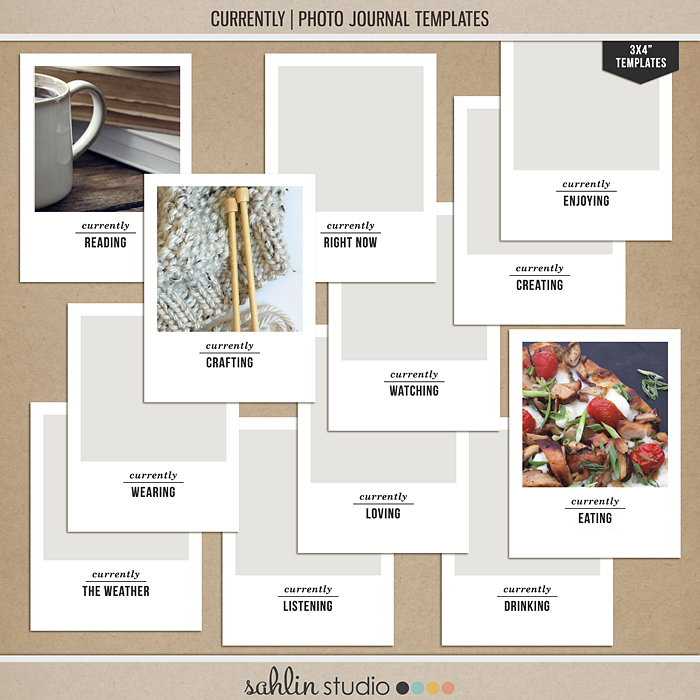
Sahlin Studio has a quite a few kits at The Lilypad with Polaroid inspired frames in them. Check out some of those options here, here, here, here, here, and here. I particularly love these Currently Photo Templates!
Wnat MORE? Embellishing Your Polaroids
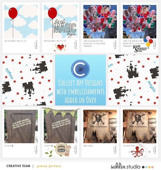
I like the pages with the Collect cards as is, but I also can’t help but wonder what some embellishing in the Over App will look like. Here are the same pages with a little something extra added to the Collect cards in Over. A tutorial with a video and screenshots for how to use Over is linked at the bottom of this post.
Before and afters of some of the embellished Collect cards used on these pages. Not necessary, but definitely fun and exactly the end look I was going for. I am so happy with how they turned out.
Project Mouse products used on these pages- Rides + Attractions, Basics cards and elements, Main Street cards and elements, Celebrate elements, Food cards, Frontier cards and elements, Adventure cards and elements, Pirates cards and elements, Tomorrow cards, pins, and artsy, America, and this Freebie. If you’re new to Project Mouse supplies my top recommendations are the Basics and Basics No.2 Bundles. Bundles are always 30% off! And these pins can’t be beat!!
Apps Needed- Collect, Project Life, and Over. Be sure to check out this for foundational info on the Project Life App, this for my Project Mouse Story, and this for when you want to embellish your pocket pages a little bit with Over. Using multiple apps may or may not be easier than using PC software, but I enjoyed trying something new (to me)! How are you documenting with Project Mouse? Please share with us in our Project Mouse Facebook Group or comment here on the blog. We love to see creativity shared! Happy Collecting!!
I’m Jenna, a traditional scrapbooker, turned hybrid scrapbooker, turned digital scrapbooker, turned app scrapper. I’ve made my way through each form of scrapbooking and love them all, but for now my motto is KISS- “Keep it simple, scrapper!” I want to also encourage anyone reading this to create without comparison. Do what works for you and be proud of it. I scrapbook mainly on my iPad using a handful of apps like the Project Life App and Affinity Photo. I prefer pocket style scrapbooking, but am not one to shy away from an awesome template and a kit full of embellishments and goodies.

July 16, 2018 at 3:39 pm
Brittany says:
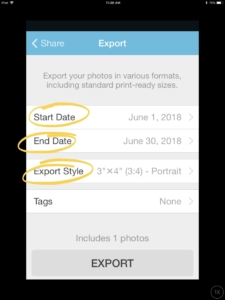
This all looks so awesome! But I’m having a hard time navigating the collect app – I can’t find where to turn on/off print bleed or how to export it without a date. Can you give me a little more direction? Thank you!
July 20, 2018 at 12:16 pm
Jenna Fortner says:
Hey Brittany! Try exporting from the calendar page in the upper right, then tap export photos, tap export style, toggle on App Print Bleed, toggle on Remember Settings, then tap the Back button and export. My settings are in the video here in this post if you want a visual. Hope this helps!