Making Templates Work for Your Style
Posted on under Scrapbooking Tutorials, TUTORIALS
Are you a cluster queen? A sweet and simple girl? A layering diva? Maybe you like to dabble in both worlds; layer it up on one page and line it up clean and simple on the next. Template packs often lend themselves to one style or the other, but the beauty of templates is their versatility. Learning to use these handy little tools in different ways is also budget-friendly. Sometimes it can be difficult, however, to see beyond the obvious, so I’m here to give you a few ideas for stretching your template stash, and making a template pack work for you no matter what your style.
I chose two different Sahlin Studio template packs to start with; one is more linear, “clean and simple,” and the other lends itself to a fuller, clustery style. But the pages I found in the gallery prove that these styles are only the beginning of your options! I also challenged myself (Michelle) to scrap a page using a template from each pack in the opposite style.
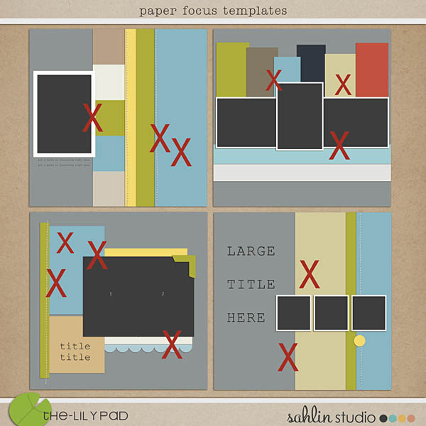
The Paper Focus Templates are neat, orderly, featuring larger photo spots and big blocks of paper.
Cayla73’s cute page exemplifies this style by leaving the template as-is, keeping things sweet and simple.

fave photo by cayla73
Christineirion’s page takes the clean lines of the template and softens them with ribbons, flowers, doodled stitching, and more layering. One of the easiest ways to alter a template is to add to it. If you love the look of a fuller page, just keep piling elements on, under, and around the existing template layers.
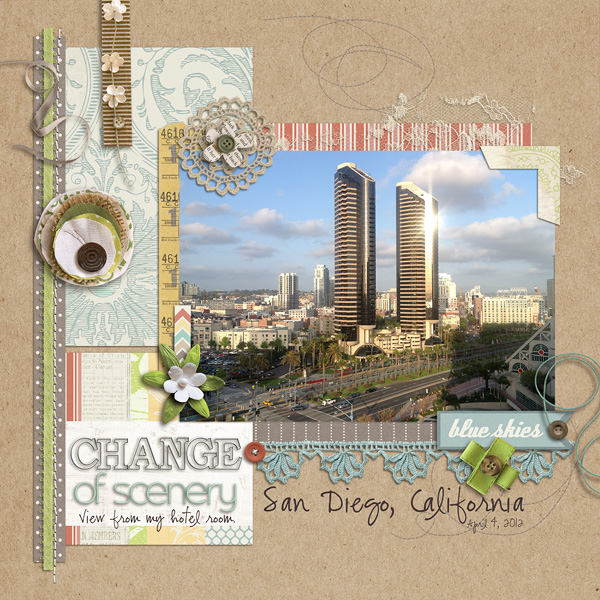
Change of Scenery by christineirion
One of my favorite template tips is to do “the flip”. Here in RebeccaH’s page we can see how turning the template around can produce an amazingly different layout. Try tilting a template to the right, left or give it a 180.

AmberR’s page showcases a fabulous way to change a single-photo into a multi-photo template – swap out paper blocks for photos, or vice versa. If you prefer lots of photos, don’t be deterred by one-photo templates. Replace paper or element spots with photos, or just add in additional photos. The reverse is also true – if you normally scrap with just one photo, replace photo slots with pretty patterned paper, journaling blocks, ephemera, or remove them altogether. AmberR also added a tag to include more journaling, and a little cluster with her title. I love the idea of using a tag in place of an element spot to hold more story – sometimes the one or two lines indicated on a template just aren’t enough!
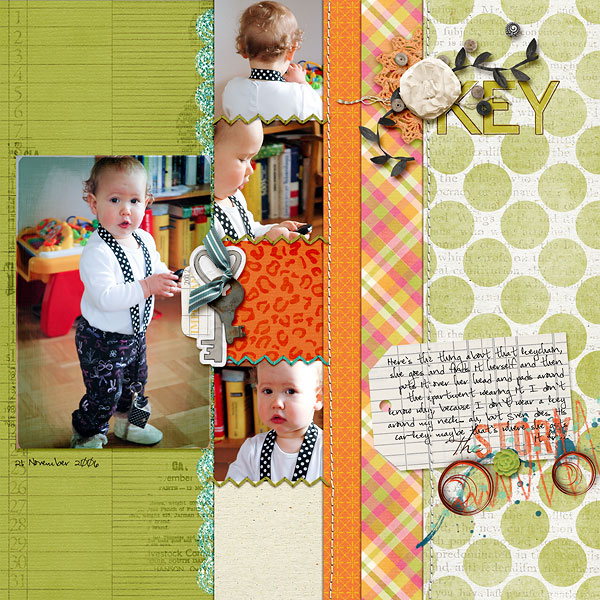
Key by AmberR
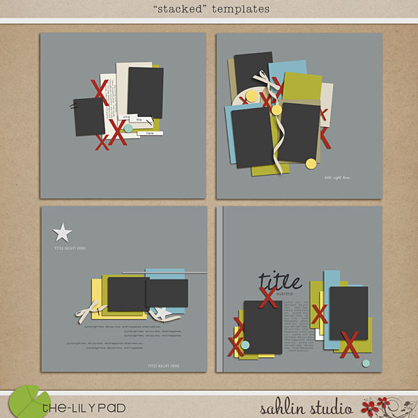
The Stacked Templates are more cluster-ish. It’s time to pile on the layers, papers and elements.
I love how AmberR made this template her own by adding interest to the background. She added a second background paper, shrunk it, and tucked in that adorable border. She also extended elements off the top paper all the way to the edge of the page, tying the layers together.
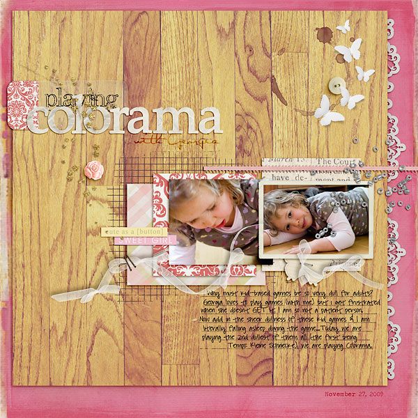
Playing Colorama by AmberR
At first glance you might not even recognize this page by cnscrap – but she did use a template from the Stacked pack! Look back at the Stacked templates preview – cnscrap used the top left one. She rotated it 90 degree clockwise, then moved the cluster into the corner. So many fun things going on in this page. A unique title placement and photo blended into the background further customize the template, allowing cnscrap to integrate her distinctive style while still enjoying the ease of a template’s basic design.
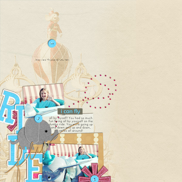
Dumbo Ride by cnscrap
I love this super full, clustery, gorgeous page by gonewiththewind. She did this template proud! I challenged myself to take the same template and simplify it. In my layout “Sick Baby,” I straightened up all the photo and paper spots, removed a few paper spots and most of the element spots, and turned it into a linear page with just a bit of pretty stacked paper to soften things up.
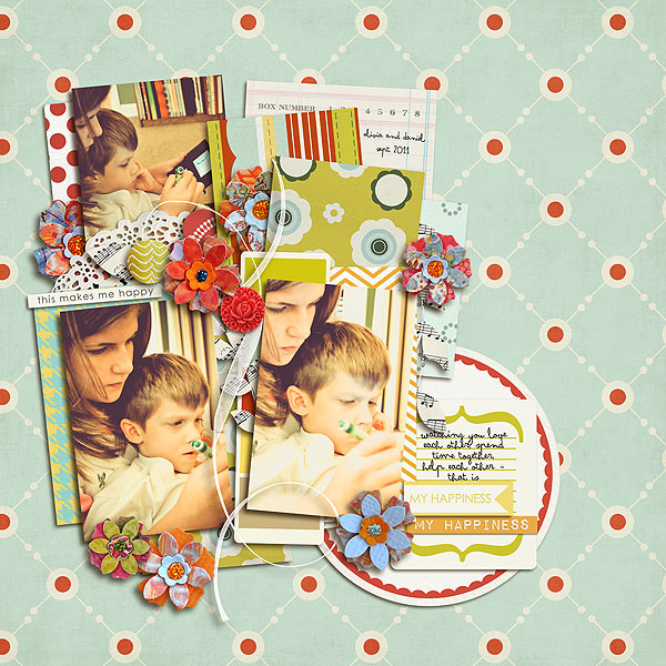
My Happiness by gonewiththewind
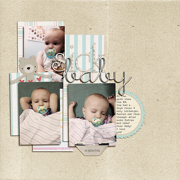
Sick Baby by editorialdragon
For my second layout, I combined two templates: one from the Paper Focus pack and one from the Stacked pack. Can you tell which ones? I liked the paper strip background on one, and the photo cluster on the other. Mashed together, the two created a fuller, more detailed page than either template alone. This is an excellent technique for those who enjoy the fuller, layered look.
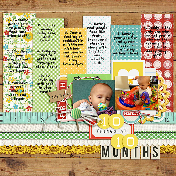
Riah 10 Months by editorialdragon
Wow, we covered a lot of ground! To summarize, here’s a quick list of ways to tweak templates to make them work for you and your style:
- Leave it as-is and let your style shine through kit choice
- Add to it
- Swap out paper blocks for photos, or vice versa
- Include extra journaling on a tag in place of an element spot or paper block
- Add interest to the background by layering papers, tucking elements in between or around the edges, or adding paint/glitter
- Rotate it
- Change the placement of the main photo/element cluster
- Place the title somewhere unexpected
- Blend a photo into the background
- Remove items
- Straighten angled items, or shake things up by setting things askew on a linear template
- Combine two templates
I hope these ideas help you look at your template stash with fresh eyes. I’m sure I haven’t even covered all the possibilities. Please share your favorite methods of personalizing templates in the comments!

July 24, 2012 at 8:49 pm
Gen says:
Great ideas! I seem to collect templates and not know what to do with them. This has given me some great ideas!
July 24, 2012 at 10:24 pm
Marlene says:
Great article! Good ideas for new ways to use my huge stash of templates.
November 13, 2012 at 10:57 pm
LaDonna Arcona says:
LOVE this. 2 questions though. 1. Where did you get that beautiful wood background paper? and 2, How did you make things come out so crisp?
November 19, 2012 at 1:05 pm
Krista says:
Hi LaDonna! I’m so glad you love these. The wood background paper is from my “I’ll Love you Forever” kit here: http://www.the-lilypad.com/store/i-ll-love-you-forever-kit-by-sahlin-studio.html As to making things crisp…. do you mean my elements? Or the layouts themselves after they are created?