Hybrid Tips, Hints and How-Tos
Posted on under TUTORIALS
Did you see the fabulous blog post a few days ago comparing a paper and digi layout? So many great tips in there for creating a hybrid layout start to finish! If you’re anything like me, this post left you hungering for more ideas, more insider info, just MORE! Well, keep reading.
We have some amazingly talented hybrid crafters on the Sahlin Studio creative team. They whip up beautiful, creative projects with the greatest of ease, and I asked them to share their best practical tips for hybrid success. I also took a closer look at some Sahlin Studio hybrid eye candy to pull some more ideas for using those digital supplies in the paper world!
TIP #1 | Design in Photoshop first
Emma Stafrace recommends that you design your project in Photoshop (or other graphics program) first, “then save each individual element separately, this enables you to drop them into a word doc and print at the exact same dimension as in your .psd file. It also takes the guess work out when trying to estimate sizing.” She writes out an easy-to-follow tutorial for this process here.
TIP #2 | Check your printer settings
Emma also shared her settings to achieve optimum printing quality: “When using Deskjet or Inkjet printers, select the CMYK settings on your printer and opt for the highest resolution, usually around 600×600 DPI, this ensures the colours are as close as possible to the original tones and that the clarity is clear.”
TIP #3 | Create a quick background or base
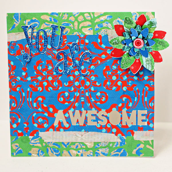
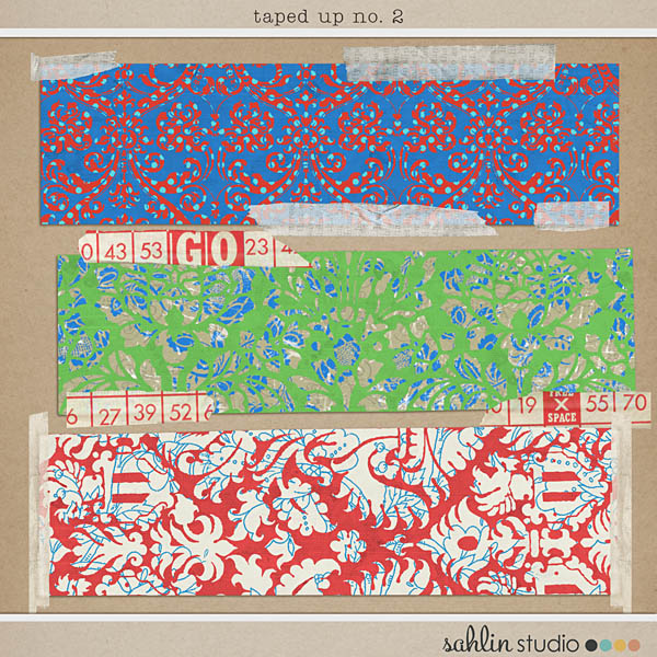
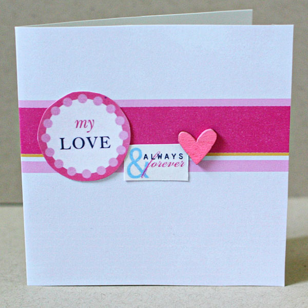
Cristina used Taped Up Swatches 2 from the July BYOC as the base for her card (then added Sparkle Gel Alpha and Recycled Paper Flowers 2on top). With the paper layers and tape, it is the perfect standalone background! What a quick and simple card!
TIP #4 | Keep it Simple
Hybrid doesn’t have to mean complicated, fussy, or expensive. Cristina chose only three simple embellishments for this card, easy shapes to cut out. The way she laid out the background paper (from Retro Color Press papers) provided the perfect area to mount her word art and heart (from the Word Bits pack). BONUS – this project uses less color ink!
TIP #5 | Customize Embellishments
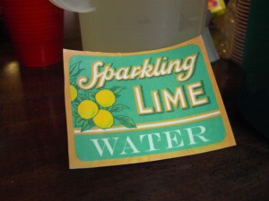
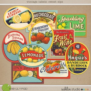
For this label, I added the word “Water” to one of the adorable labels in Vintage Labels: Sweet Sips. I similarly customized other labels from that pack to create little cards for cupcakes, lemonade, and more.
TIP #6 | Disguise Imperfections
I admit, I have scissor issues. I can’t cut a smooth, straight line to save my life. My favorite method for hiding less-than-perfect cuts is to pull out a coordinating ink pad and swipe it around the edges. The ink gives great definition and disguises uneven lines at the same time.
TIP #7 | Choose the Right Paper
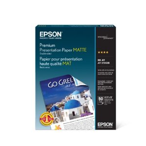
Cristina, another Sahlin Studio hybrid guru, says, “Actually, the choice of paper is quite important. I find that using matte paper is what works best for printing out digital designs. I am using Canon Matte Photo Paper at the moment, and I’ve also used Epson Presentation Paper in the past (I usually buy it when it’s on sale) – on this kind of paper the colors turn out really vibrant. On my printer, I match the settings to the type of paper I’m using (most printers have preset settings based on the type of paper you are using).
My printer is a regular multi-function printer (color inkjet printer + scanner), 5 years old. A rather basic and cheap model, but it works great. It is able to print borderless (i.e., can print full bleed on a sheet of paper) and that turns out to be quite handy to use up all the sheet of paper.”
TIP #8 | Dress Up Your Photos
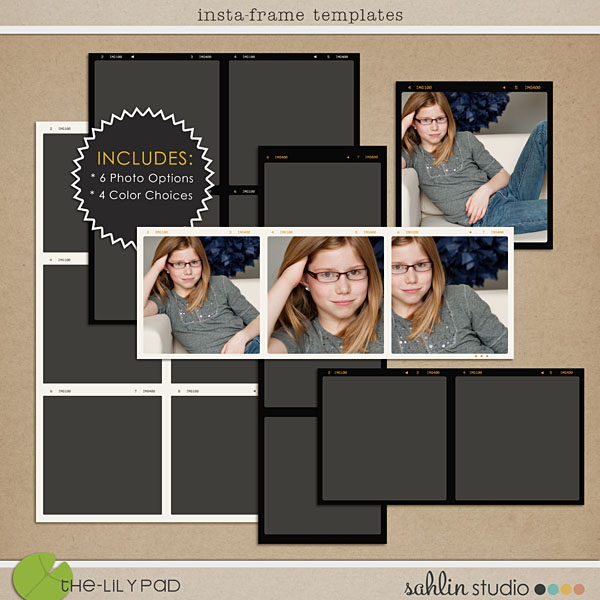
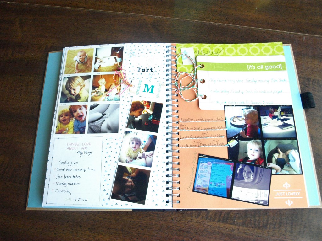
Perhaps one of the easiest and most popular hybrid projects is using digital supplies to adorn photos before printing them. Cristina and I have both used the Insta-Frame Templates for our Project Life and Week in the Life projects. I formatted all my photos on 4×6 canvases using the Insta-Frame templates (making them all roughly 2″x2″), printed the 4x6s at Walgreens, and cut them apart to use in my Week in the Life book (see one page below). You could do something similar with any digital frame. Using a 4×6 (or 5×7, or any standard photo size) makes it easy to print at your favorite local print shop (especially if you had a lot of photos like I did), or on your home photo printer.
TIP #9 | Design a Custom Project Life card
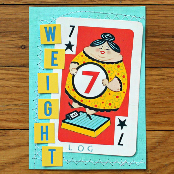
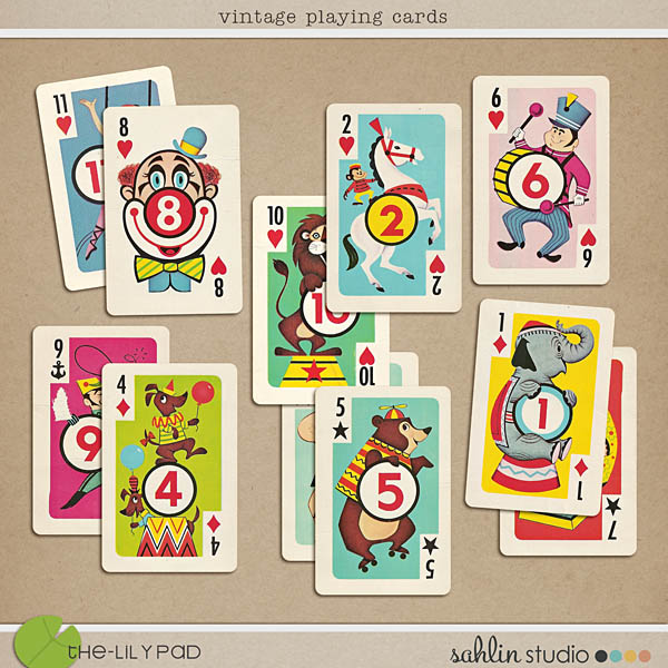
If you’re on the Project Life bandwagon, you know there are hundreds (thousands?) of options for cute journaling and filler cards. But if you can’t find the perfect one, why not make your own? Create a 3″x4″ canvas in Photoshop and decorate away with your digital stash! Cristina created this adorable card for her Project Life using Vintage Playing Cards, and Anagram Letter Tile alpha.

I hope this mish-mash of ideas and tips has encouraged you to add a little hybrid spice to your crafting life! Have fun, don’t be afraid to make a few mistakes, get your hands messy, and come back to share your projects with us!

August 7, 2012 at 1:20 pm
Linda says:
I think the tip to print using CMYK settings for your desk jet printer is incorrect!
August 8, 2012 at 9:02 am
Krista says:
I took tips straight from my hybrid artists… Emma recommended this tip for printing. Her stuff turns out fabulously. Do you have a specific way you like to print? I certainly can add it to the article!
August 8, 2012 at 2:56 pm
New Orleans Hornets Snapback says:
I love your writing style genuinely enjoying this site.
August 9, 2012 at 2:05 am
willimena says:
Hi. Not sure where to leave this comment but anyway… just wanted to say thanks so much for the newletter freebie! I can’t get over how generous that is. Thankyou for your sharing your creativity and time. And for next time, where would I put this comment 🙂
August 9, 2012 at 7:28 am
Krista says:
AWwwww… I’m so glad you like it, and that you commented to let me know!! You are so welcome!