Project Life Inspiration: A Clear See-Through Pocket
Posted on under Hybrid Layouts, POCKET THIS | Project Life® Inspiration
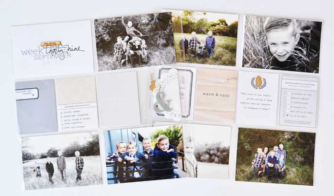
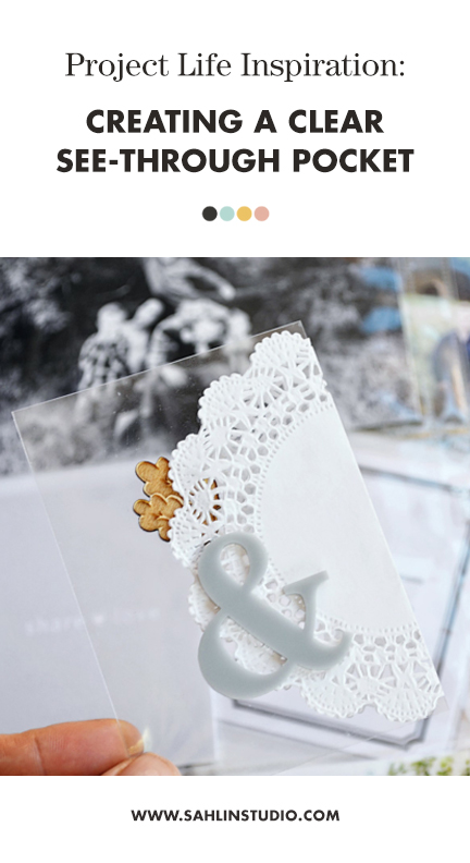
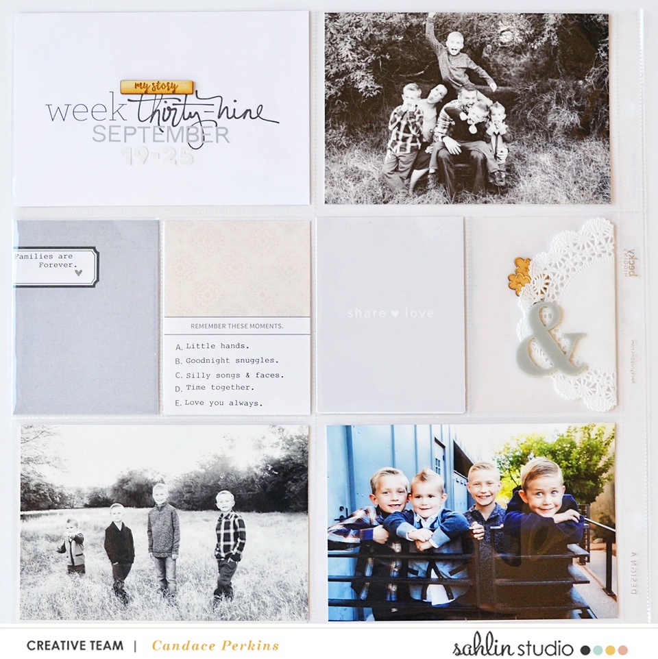
Hello friends! Candace here, with a fun tip for you to try on your next pocket page. I’d like to show you how you can use one of your 3×4″ or 4×6″ pockets to create a “see-through” or clear pocket design. It looks SO beautiful and adds such a neat dimension to your page. I hope this inspires you to try leaving one of your pockets “clear”.
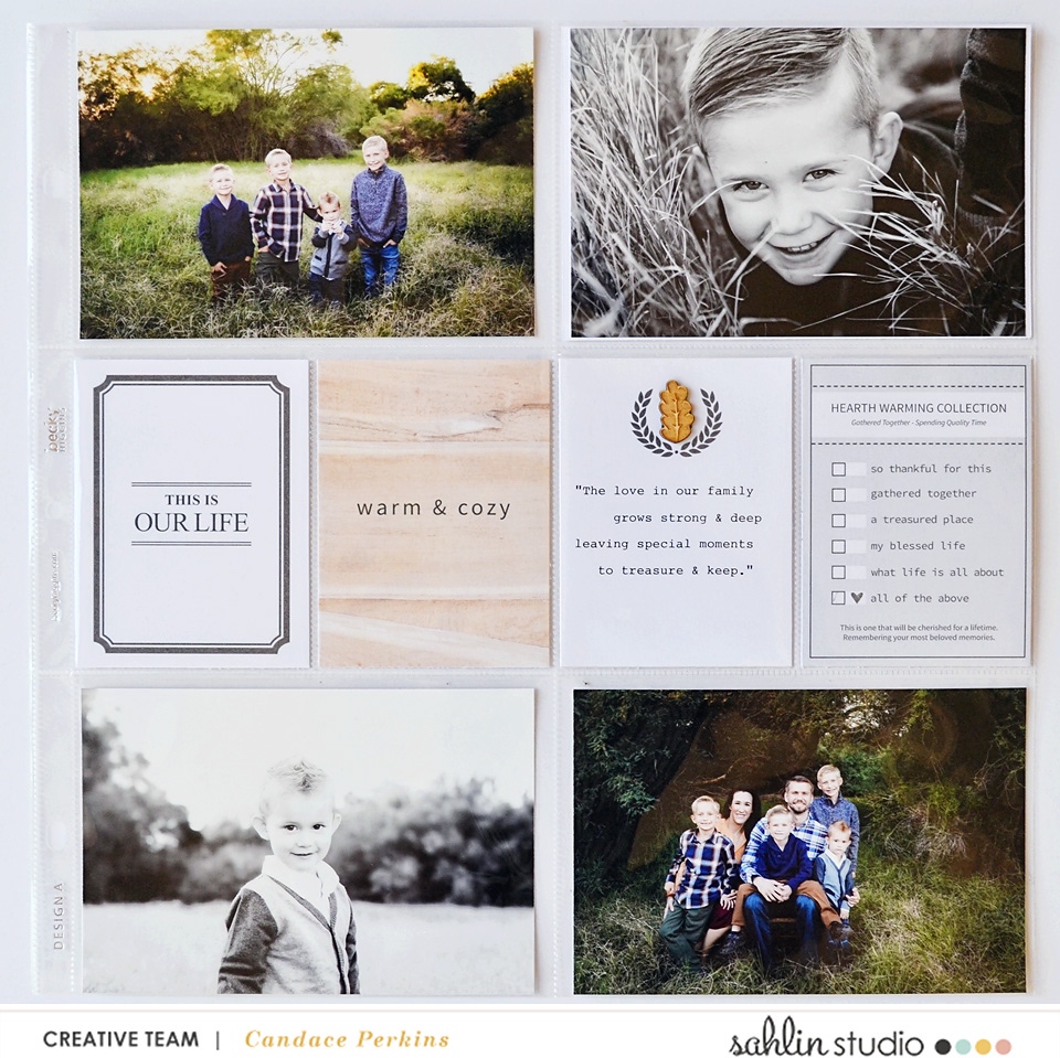
In week 39 we had fall family photos taken, they turned out so amazing!! I really wanted to focus on the feel of “family and love” for this spread, so I thought the Chesterfield (Journal Cards) would be perfect for these special family photos. The colors of these cards are warm and neutral, and the theme focuses on family and special moments spent together. I love this. This is what family is all about… time spent together.
Left Hand Side
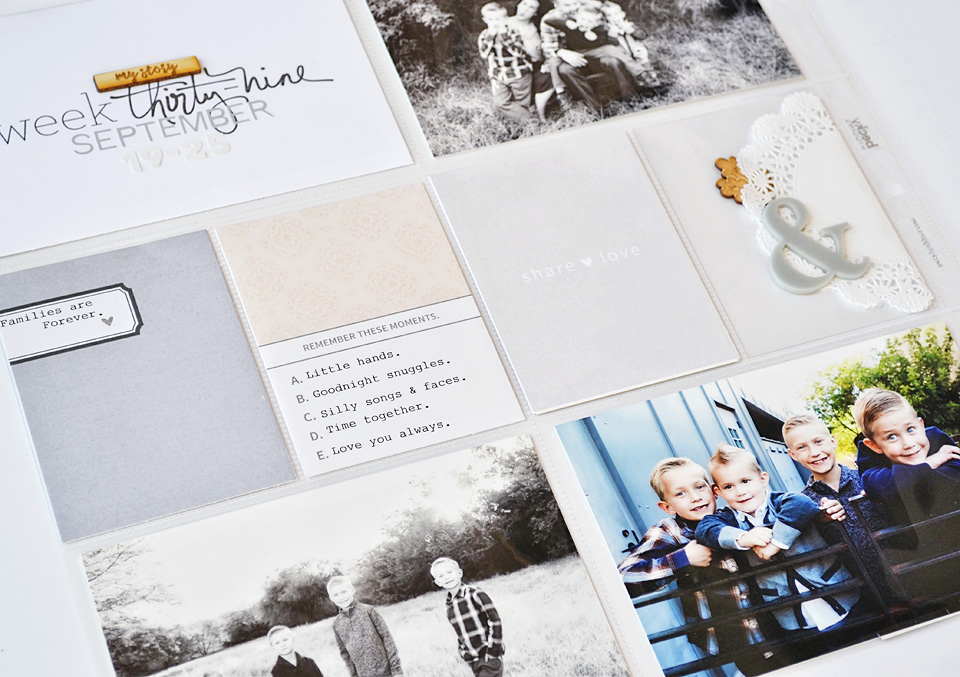
Here is a look at how I used this tip in week 39 of my Project Life spread. I love how the clear pockets will break up the monotony of similar weekly spreads and give you a little peek in to the previous or next week.
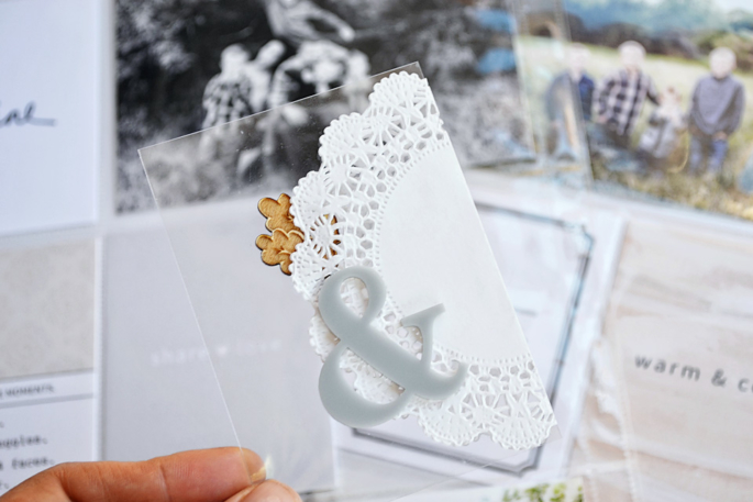
I wanted to stick with the feel of the spread, which is why I decided to go with a CLEAR pocket. So I used a 3×4 piece of acetate, and added a delicate doily along with a beautiful leaf wood veneer and acrylic ampersand from Color Cast Designs.
Right Hand Side
Project Life Tip #2 – ADD warmth and continuity across your page by placing some wood veneer pieces across your spread to help the eye travel around the page.
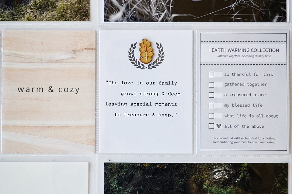
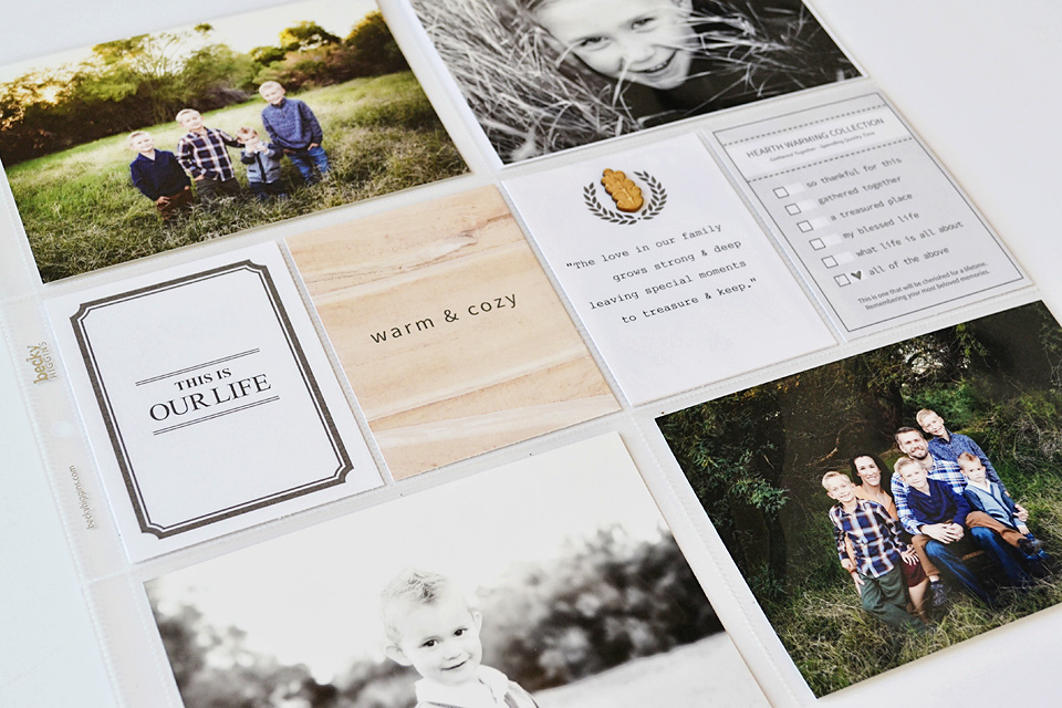
I added a sweet quote about families to a journaling card on the right side of the spread.
Products Used:
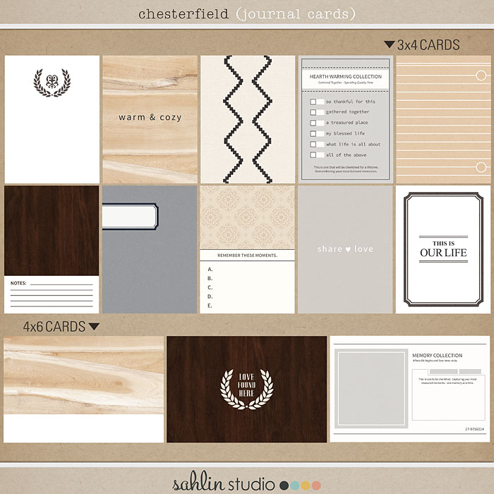
Sahlin Studio Products: Chesterfield (Journal Cards);
ColorCast Designs – wood veneer
Thanks for stopping! I hope this inspired you to try creating a see-through pocket on your next spread!
This is me. I am a wife, a mother, a sister, a daughter and a friend. My days are filled with cleaning dishes, driving kids to practice, kissing boo boos, singing nursery songs, calling a friend, folding mounds of laundry, cleaning the dishes AGAIN, washing tushies and toes, tucking little ones in bed, and then doing it all again. But in our crazy, busy, wonderful lives there is everyday perfection. Moments where time seems to stop, you take a picture in your mind, and promise yourself you will never forget. Everyday perfection. It is my hope that I can inspire others to notice those moments of everyday perfection, capture them, document them and cherish them.
