POCKET THIS / Project Life® Inspiration | Journaling On Photos
Posted on under POCKET THIS | Project Life® Inspiration
For most of us the main reason we do any kind of scrapbooking is to document our lives. Pocket scrapbooking is no exception. Considering that we are documenting trips, events, and our daily lives there are three main components: photographs, mementos, and the written word. For this article we are going to explore the ways to memorialize The Written Word – On Photographs.
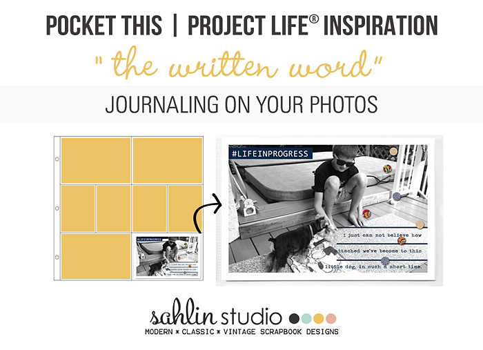
Whether is it in the form of journaling, a snip-it of thought or a title, including the written word in our spreads is as important as photos and memorabilia are for telling our stories. This technique is perfect for both digital and hybrid scrappers alike… journaling with actual pen in hand, a font or a stamp/brush.
Let’s look at a few different examples of how to do this.
Basic Text Journal on Photos:
Using text for journaling when you have something to say, but don’t want it to stand out too much. The trick? Use white text on dark areas on a photo OR dark text on light areas on a photo.
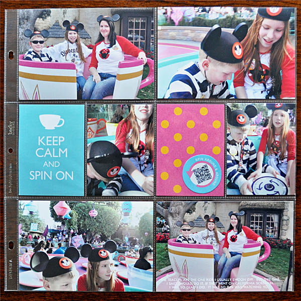
(Dark Text on a Lighter Portion of the Photo:)
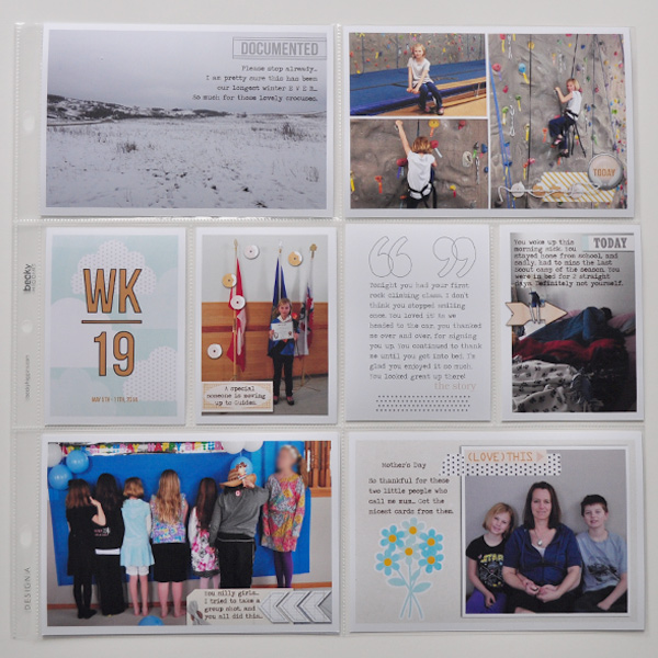
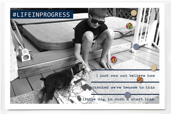
Use LINES to help anchor your text:
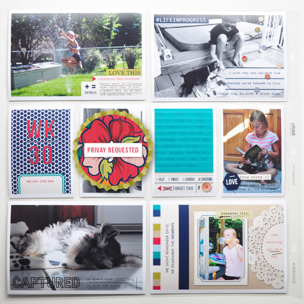
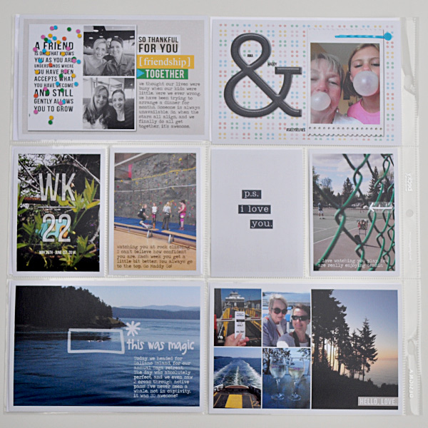
I LOVE how Candy used “line elements” and placed them straight on the photo. Then, she used this as a guide for writing her journaling straight onto the photo. It looks amazing besides the fact it helps to tell the story.
Use Word Art as Photo Overlays
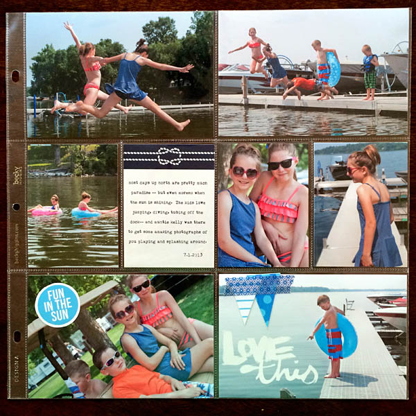
Using a piece of word art can help in the process of telling your story. When you take a photo and add just a few words it transports the users mind to know more of the story… allowing you to focus on a certain aspect on your photo, or a “story” behind the photo.
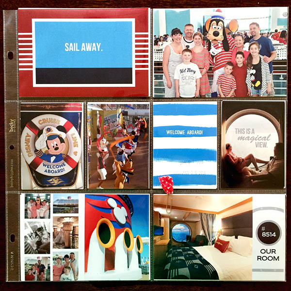
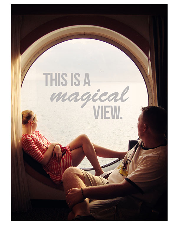
Keep it “short & clever”. Try using text to write something more organically than a whole bunch of journaling. Like the phrase, “this is a magical view“, in the layout below. It helped to tell the story without a lot of journaling.
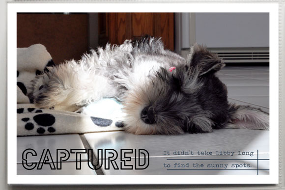
Using Stroked Text for Titles.
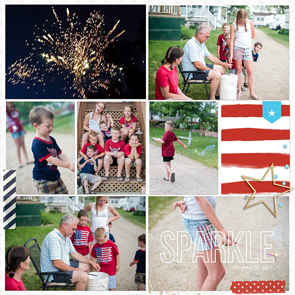
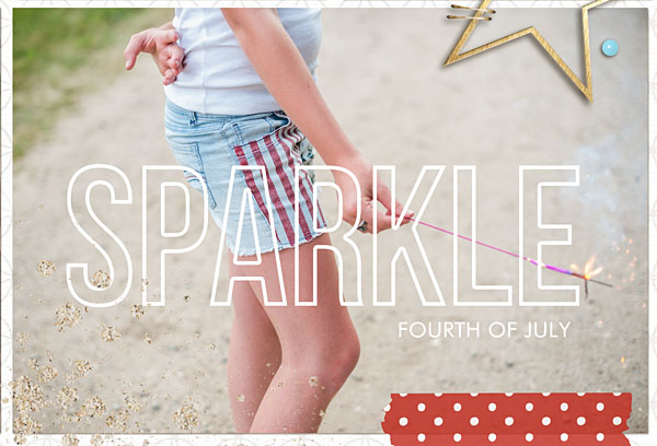
Using a stroked text on top of photos is my favorite techniques!! The results are perfect over any photo. (TIPS TO TRY: Try using a font or alpha, put a light stroke on it, then take away the fill.)
Use Different Blend Mode or Low Opacity
Sometimes you have alot to say on the page. You have many photos all of which “could” potentially be different stories. Try this technique: Using text for your title, and lower opacity to blend it into the photo. This is a perfect way to not be the dominating title, yet still help in your storytelling.
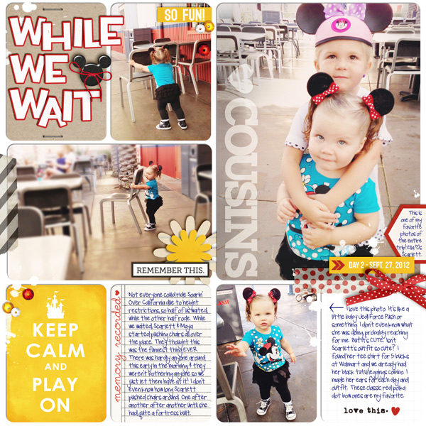
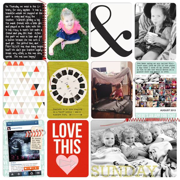
LOOK CLOSE: In this layout (below) Britt used the technique of “lowering the opacity” on her font to to help the reader tell the day of the week a photo was taken. PERFECT!
Using Elements Can Help Focus the Story:
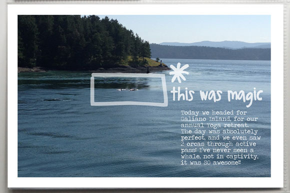
Using a few digital elements can help draw your eye into text and your story.
I think using a digital element (like a doodle), along with text can draw the attention to the focus of the story. As seen in this above project life layout, she used a doodle and “this was magic” to draw the eye in.
Draw Focus into a Photo by using Arrows:
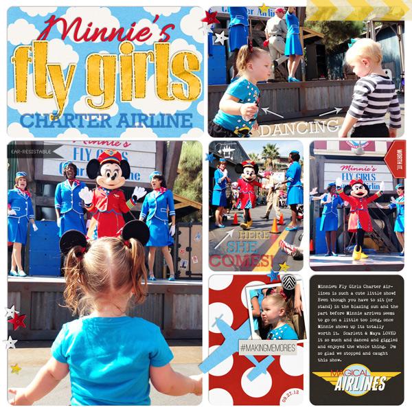
Another way to draw attention to your journaling is by using arrows. Using arrows can help to direct your eye right to the story.
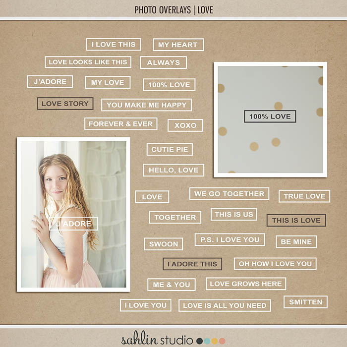
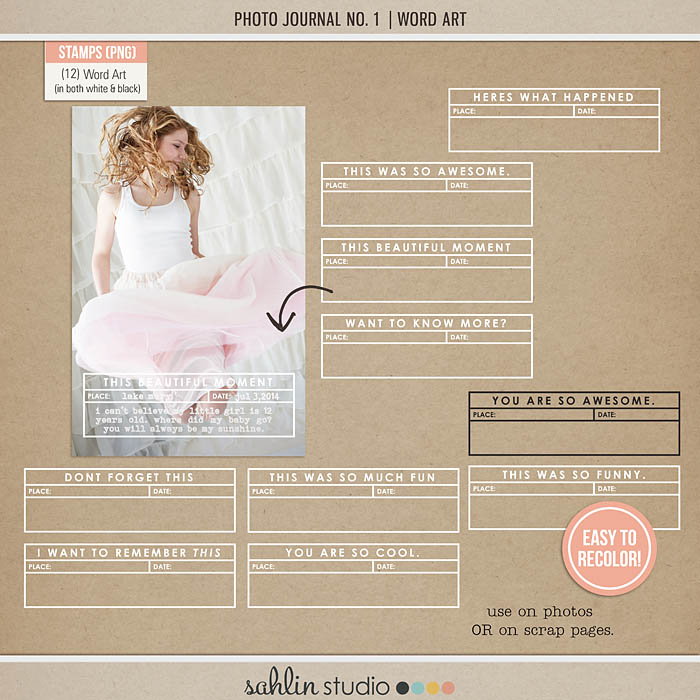
Has all this awesome inspiration gotten you thinking about using this technique in your next spread? Not sure where to start? Well, let’s start with the fact that all of Sahlin Studio’s Element Packs and Kits as well as the Lilypad’s Memory Pockets Monthly Collabs have digital brushes/stamps perfect for this technique. Don’t forget the Photo Overlays: Love and Photo Journal No.1 (word art) products perfect for quickly adding an overlay or journaling spot to your photos.
Looking for something a little more personal? Grab your favorite fonts and create an overlay or add some journaling to your photos. A great typewriter font like Bohemian Typewriter will give you a clean line journaling look. Want to warm up your page with a handwriting font? Make sure to check out all the awesome handwriting fonts available for free from Fonts for Peas – you’re sure to find one that will closely resembles your own writing. Let’s not forget about some of the great title fonts out there. Title fonts such as Century Schoolbook are great for creating your own overlays for your photos.
Chomping at the bit to get started? Well, don’t let us hold you up any longer! Make sure to come back and link us up in the comments with your creations using The Written Word – On Photos!

September 3, 2015 at 8:01 am
Joan Bandy says:
I really love how you’ve done this. I’d like some advice for how to go back and do this when you’ve printed a lot of photos to go into slots, then need to go back and journal things about the story later. I’m thinking a labeler may work? Or label sickers on the photo pockets? I’m wondering how to make this athetically pleasing. I’m more about representing years than making a page about one individually stories, so there are a lot of stories on a page. Thanks!
August 1, 2016 at 5:15 am
6 Tips for Journaling on Photos – Scrap Booking says:
[…] Source: POCKET THIS / Project Life® Inspiration | Journaling On Photos | Sahlin Studio | Digital Scrapbooki… […]