Change the Text Spacing in Photosohop “Tracking and Leading”
Posted on under Scrapbooking Tutorials, TUTORIALS
Do you ever want to line up your journaling with the lines on a journal card, or fit it onto a tag? How about creating a title with letters spaced extra-wide or closer together? If so, then you need to know a little bit about leading and tracking.
![]()
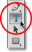
Before we start, make sure your Type tool is selected, and open the Character palette.
Leading
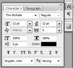
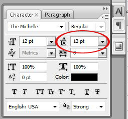
The term leading is derived from the practice of placing lead strips between lines of type on older hand-set printing presses such as a letterpress. It refers to the distance between lines of type (and it’s pronounced “ledding”). You can find the box to adjust leading in the Character Palette in Photoshop. Look for the icon with two As stacked on top of each other:
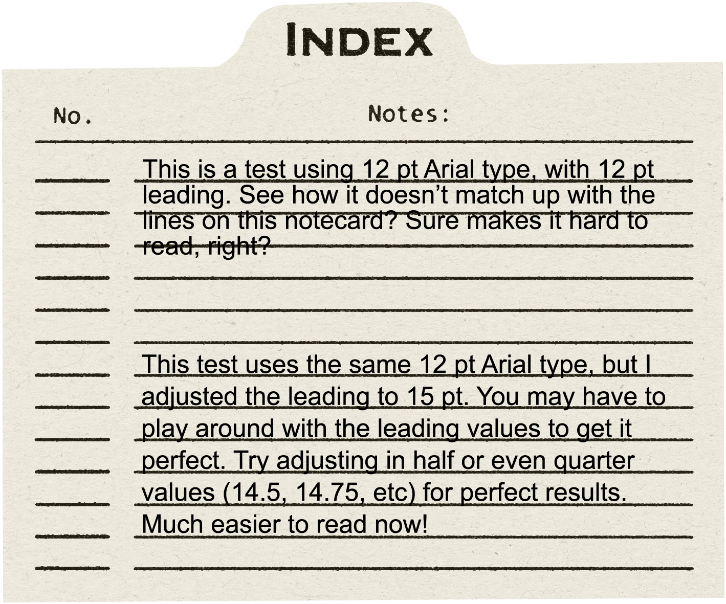
Here’s a quick comparison of sentences using various sizes of leading to give you a visual:
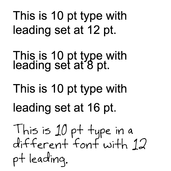
As you can see in the image above, changing the point size on the leading affects the distance between your lines of type. Different fonts often need different leading, too, so if you’re journaling in a pretty, scripty font that seems too “squished,” try upping the leading to get some breathing space in your block of journaling.
See an example of leading in action on this journal card:
Tracking
Now that you’ve got leading down, tracking is a piece of cake. Instead of spacing between lines, tracking is the spacing between each character. You can find the tracking adjustment menu right below leading on the character palette.
![]()
It’s normally set to zero. If you need more space between your letters/characters, bump up the number until it looks right! Here’s an example:
![]()
You might adjust your tracking to get a title or line of text to fit within a certain area, such as on a journaling strip or across a photo. Different fonts look better with different sizes of tracking and leading, so the next time you type out your journaling, play around with these type tools to get the perfect, custom look!

August 28, 2013 at 3:59 pm
Eileen says:
Great tutorial! Thanks for posting! Looking forward to more and learning a lot from you!
August 28, 2013 at 4:20 pm
Amy says:
This is fantastic. Thanks for the tutorial
August 29, 2013 at 3:06 am
Karen Diebolt says:
Thanks for this great tutorial. I did my first journal layout a couple of days ago and couldn’t figure this out. I made it look somewhat decent but this will make it perfect.
August 29, 2013 at 10:41 am
Mary says:
Sounds really great. Does it work in Elements 7 or 10? I don’t have Photoshop
September 4, 2013 at 10:48 am
Jenny B. says:
You can adjust leading in PSE, but not tracking. I found a script that will allow you to adjust it, though! It is tedious, but it does work. Here’s a link with the instructions:
Script: Adjust tracking (character spacing) of text in PSE
September 4, 2013 at 12:10 pm
Krista says:
Hmmm… looks like a fun resource. Although, it’s such a easy and simple fix… I prefer not to go the long round about way!! HAHA!
September 6, 2013 at 7:55 am
Sandra says:
Thank you for this wonderful tutorial. I have really needed this information and will certainly put it to use.
February 21, 2014 at 10:56 am
kali says:
PS needs a feature to do **line-spacing** as a separate feature from **paragraph spacing**, like MS Word does….
if I have three paragraphs of font, say 12pt, and want 18pt between the paragraphs, PS also puts 18pt between THE LINES OF THE PARAGRAPH!! this is a glaring omission on the part of Adobe.. they really should think about this for the next upgrade….
April 25, 2015 at 5:29 am
DARIO says:
thank you for this tutorial. Three thumbs up.