Color Palettes: From Inspiration to Layout
Posted on under INSPIRATION
Have you seen those gorgeous color palettes (or color boards) floating around the web lately? One or more drool-worthy photos accompanied by a color palette strip, all neatly packaged and ready to inspire your creativity. The Lilypad recently hosted
a BYOC Inspiration Challenge that asked scrappers to submit their favorite color scheme or inspiration board, and I have never seen so much gorgeous color in one place! Scrolling through the threads makes me itch to sort through my kit folders and start creating… something. The photos are beautiful, the colors inspiring – but how do you turn it all into a layout? If you’ve been wondering the same thing, keep reading. The Sahlin Studio creative team helped me gather several lovely color boards and layouts inspired by them (along with a few coordinating product examples), plus a few tips for turning your favorite color inspiration into a layout, too!
Inspiration #1
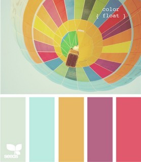
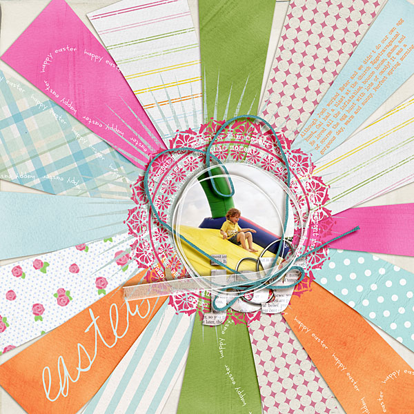
To start, here’s a pretty spring/summer sight – a colorful hot air balloon (image from Design Seeds). The colors remind me of Easter eggs, sherbet, warm spring days, and all things sweet. I could have just used the colors and scrapped a layout about anything, but I chose to let the photo inspire me a little further and created a color wheel effect on my layout, similar to the underside of the balloon. To lift this technique for your own page, try imitating a shape or pattern from an inspiration photo(s).
color inspiration:
layout:
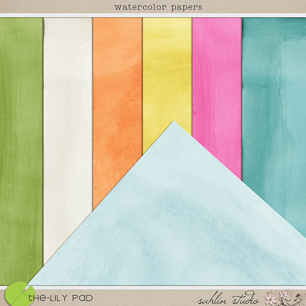
products used:

Inspiration #2
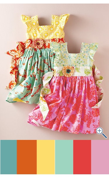
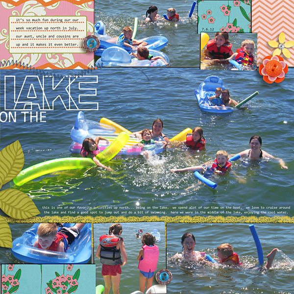
Krista found this adorable photo of summery little girl dresses by Garnet Hill and turned it into a summery layout of fun on the lake. I love how the bright flowers and bits of patterned paper on her otherwise minimally-embellished page echo the flowers and patterns on the dresses. On your next inspiration board, look for an item or motif that could enhance your layout – like the flower embellishments on the dresses that Krista repeated on her layout.
color inspiration:
 layout:
products used:
Inspiration #3
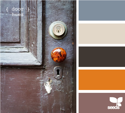
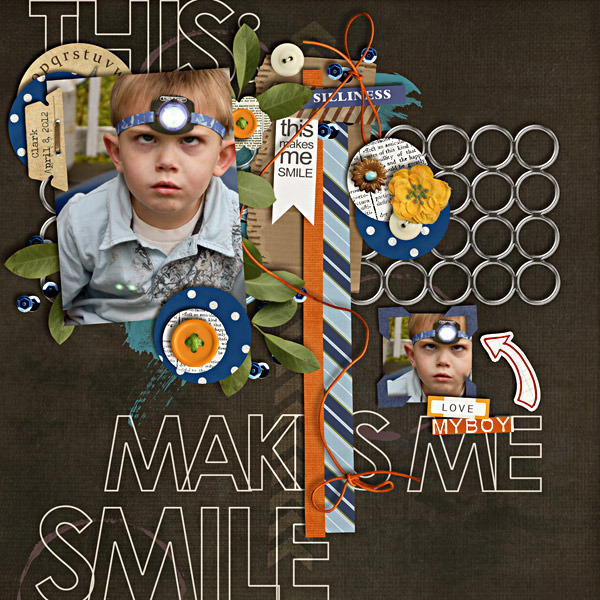
Mary (plumdumpling) found a neat masculine color scheme in this door image, also from Design Seeds. Doesn’t that pop of orange reach out and grab your attention? Mary created the same attention-grabbing design on her layout by keeping it mostly neutral. Those pops of bright orange draw the eye perfectly around the page, and the blue grounds everything, balances the brown, and matches the blue headband on her cute little boy. This layout exemplifies how to use a color scheme – choose one main color (like the brown here), one secondary color (blue), and one accent color (orange). Obviously this isn’t a rigid rule, but it’s a great guideline to get you started translating a color palette to a layout.
color inspiration:
layout:
products used:
Inspiration #4
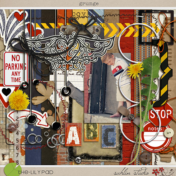
Krista P. (norton94) found this eye candy on A Creative Mint blog, and if you’re looking for totally drool-worthy photos to inspire you, definitely check out this blog! I can see so many layout ideas in this one photo – how about that stamped “Hello” sentiment? Or the map paper, little hanging tags, or the paint swatch strip? Krista P. borrowed the washi tape, buttons, bright colors, ledger/office-style papers and of course that cool cork background to jumpstart her page. I adore the bits of washi tape, they add the perfect pop of bright color without overwhelming a layout or detracting from all the amazing photos she fit onto her two-page spread. Doesn’t her page look like it could actually be pinned up to a real corkboard? Sometimes you just have to go with the obvious inspiration from a picture!
color inspiration: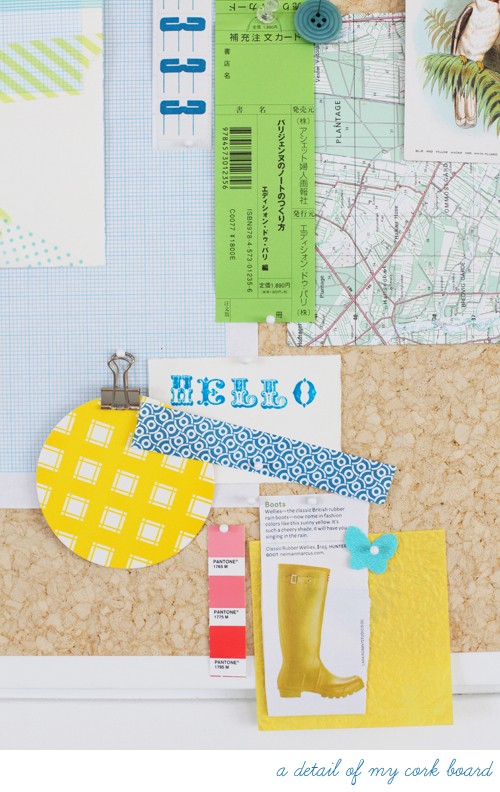
layout: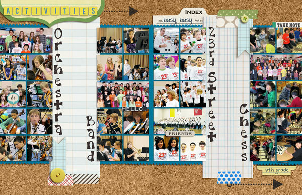
products used:
Give Color Palettes a TRY!
I hope you picked up a few handy pointers on how to convert a color inspiration board into a beautiful layout. One last tip, when choosing products to create your layout, look beyond the colors of your chosen palette. Maybe you pull the perfect purple from one kit, the ideal green from another, a few flowers from a third. It’s okay to mix and match. Most of the layouts in this blog post were created using multiple kits, since you’ll rarely find a single kit that lines up with every single color/theme/item in your inspiration photo. Unless, of course, the designer was inspired by the same image, then you’re in luck! Either way, have fun mixing and matching and let your imagination guide you!

May 18, 2012 at 4:53 pm
Kimberlee says:
Fabulous post! I love seeing how color inspires other people. I am not one of those people who usually matches kits to my pictures, so this is far more inspiring to me than to pick a blue kit just because the main person in the photo is wearing a blue dress.
May 4, 2013 at 4:13 pm
michelle says:
love your work it is so beautiful and quite an inspiration to me
October 22, 2015 at 9:17 am
Beth Belair says:
This is a great post! I’m always afraid to mix kits together because I’m more confident that everything will go together if it’s all from one kit. I love the idea of using inspiration from something other than just your photo to tell you that, yes, those two papers can work together just fine. Thank you for some great inspiration!
October 22, 2015 at 9:39 am
Krista says:
Glad you were inspired!! It’s fun to take inspiration from the everyday things all around us to use in our memory keeping!!