How To Make Digital Paint and Word Art Look Real
Posted on under Scrapbooking Tutorials, TUTORIALS
Hello all, Crystal Livesay (from Live Your Stories). When writing this article, I could not for the life of me think of what to title this post, but I am going to show you how to digital “cut” paint or other written or drawn elements to bring more realism to your digital scrapbook pages. Like this page!
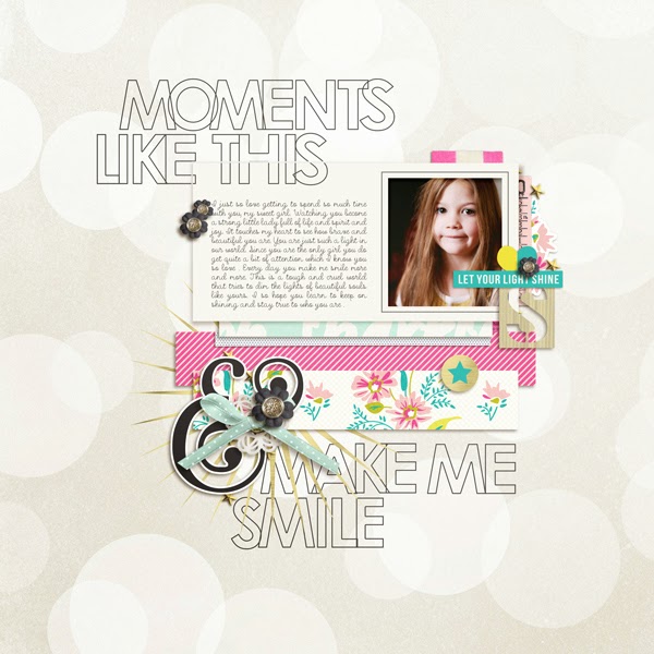
You can see at the top where it looks like it was written and the paper moved a bit. If you were doing a traditional paper page and you used paint or writing across an element and onto the background paper, the element would be raised a bit. When your digi scrapping it’s easy to forget about how things would appear on a traditional page and this one of those simple and easy things that you can do to make your page seem a little less digital!
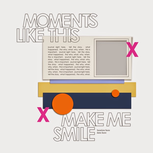
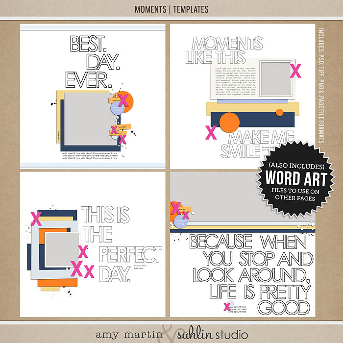
I started the page with these AMAZING templates by Sahlin Studios and Amy Martin. They are so much fun and come with the word art which is awesome if you struggle with titles like I do!
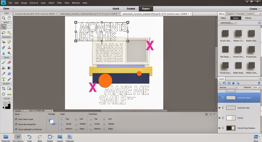
The first thing you need to do is duplicate the word art layer. Just right click on it in the layers palette and select “Duplicate”. Now take the bottom word art and make sure that it is below whatever element you will be cutting your word art or paint from. On this page it is the frame. So I took the bottom word art and made sure it was the layer right above my background because I want some of my elements to be able to be on top of it. I am going to take the word art layer that is on top and make sure it is on the layer directly above my photo frame. I need one more word art layer on top so I am going to duplicate just the top most word art now. Also, the only part of the word art that is going to be clipped is the “moments like this” so I am going to select BOTH the top most word arts and use the eraser tool and erase “make me smile” from both of them.
You can see in this screen shot that now the top two word arts are just the “moments like this” I have it selected so it has a box around it to show you the size. You can click on it to make it bigger.
You can do this same thing but in reverse to the bottom word art that is now just above your background layer. You will erase “moments like this” from it.
Time to Cut
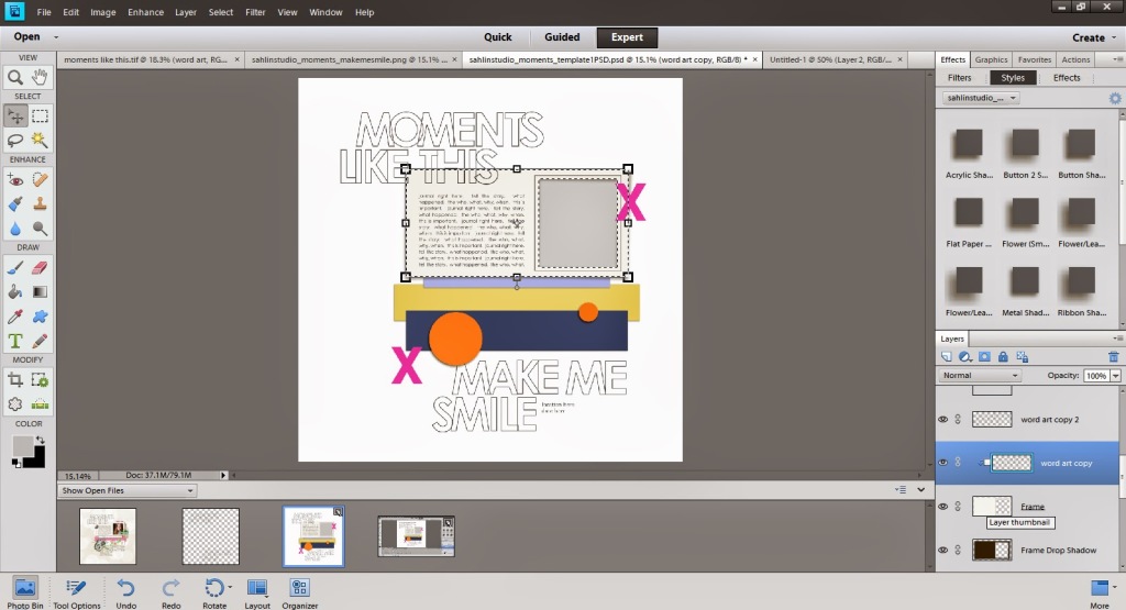
Now it’s time to cut! in the layers palette you will clip the word art that is just above the frame to the frame itself. You can do this by taking your mouse and while holding “alt” on the keyboard hover in between the frame layer and the word art layer. You will get two overlapping circles. When those appear just click with your mouse. I tried so hard to take a screen shot of the two little circles that appear with your mouse but they disappear. If anyone has any questions about them please just let me know and I will try to do a screen capture in video format for you.
At this point you have three different word arts. A very bottom one just about your background. One clipped to the frame and the last one just about it. Now, hole Ctrl and click on the frame layer in your layers palette. It will make the “marching ants” appear around it. So it will look like this:
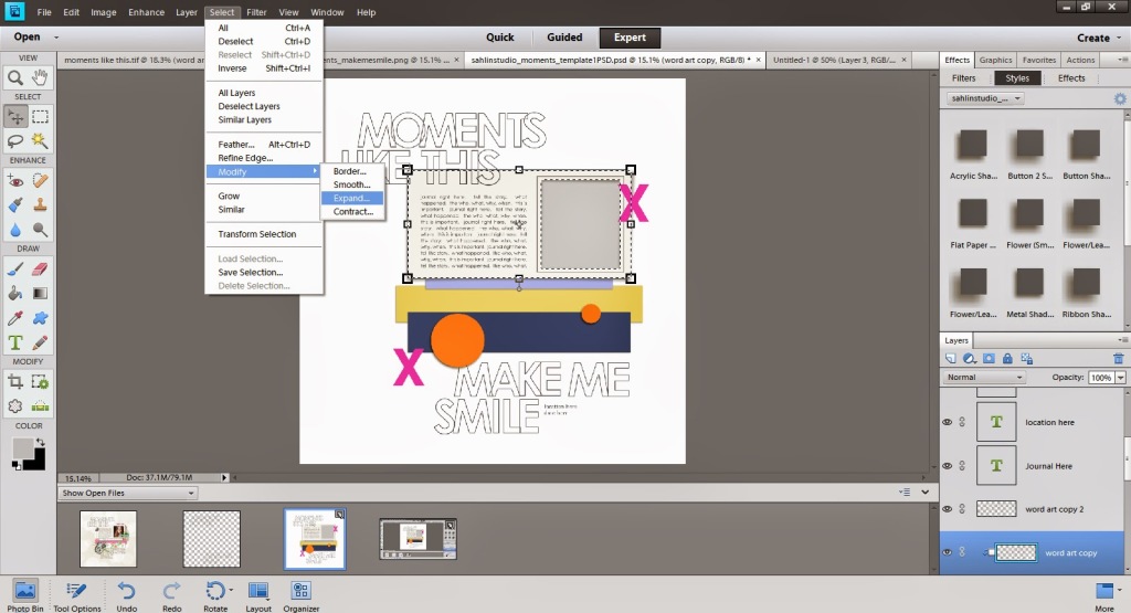
With the marching ants going and the frame selected in your layers palette go to the top click Select > Modify > Expand.
You might have to test how much you want to expand because everyone’s taste is so different! I always start with 10 or 15 and go from there. So decide how much you want to expand and then the marching ants will move out a little bit from the frame. Click on the top most layer of word art now and then click Ctrl and X at the same time. I did 15 when I expanded and was happy with how that looked. So now your page will look like this:
Just finish up your page like normal now! It gives your paint and written elements a much much more realistic feel!It is entirely possible that someone out there is reading this and thinking that they have a much easier way of doing this. If so, please tell me! This isn’t at all hard but there are quite a few steps. It’s easy peasy once you have the hang of it though. Definitely share if you have a better way though! I would love to learn!!
You can CLICK HERE for full credits for my layout. I hope you enjoyed and learned a wee bit of something. If there is ever a topic you would like for me to talk about just let me know! I might try to do just a regular layout walk through one day if that is something you might like!
Products Used:

July 6, 2016 at 11:52 am
Monica says:
Thanks for this tutorial. I’ve always wondered how to do this so now I need to try it!
July 7, 2016 at 12:19 pm
Krista says:
YAY!! It’s always wonderful to learn a new technique. Definitely give this a whirl!!
July 7, 2016 at 2:32 am
CraftCrave | DigiFree | CraftCrave says:
[…] How To Make Digital Paint and Word Art Look Real – 1 freebie(s)? […]